Where to begin? Well, let me just start with - have you seen the new Prima paper lines? They are so beautiful! I have always been lover of Prima; from the amazing papers to the gorgeous blossoms. In the past few years you can add all of the fun embellishments and great new stamp lines to my list of favorites. Just wrap it all up and call me happy!
So, let's get down to business. I want to share 3 of my projects with you.
First up is a fun mini album I created using the Stationer's Desk collection. Yes, I have posted this project earlier. However, this time I will give you all the pages here.
This mini album measures in at 6 x 7 for the pages with a 6 x 9 clipboard for the back. The chipboard elements, ATC pad, and paper collection have been used to make it along with Prima engraver flowers and other Prima flowers. Also used is a Prima stamp (see the "post card" on this tag? That's it!)
The new lace stickers by Prima have also been used throughout the mini. I love lace, especially vintage lace, and ribbons so you can see a variety have been used.
My pages have large pockets and pages that flip open.
I like mini albums that are interactive. This page, as shown above, has a double pocket on the front.
And it flips up on the back of the page.
Again, a double pocket just set askew!
A particular favorite of mine is to add areas for journaling. This large crimson mat has only been adhered on 3 sides to allow several of the ATC cards to slip into the left edge. Perfect to add journaling, or even small pictures, on,
Large Prima lace doily sticker. Love those!
The back of the mini album is a clipboard that was made using the new Tim Holtz clipboard pieces. I love that it is completely functional. What a great way to add pictures!
The mini is held together using 2 mini alligator clips with a small chain between them. It really sets off the vintage feel of the mini album and looks cute too!
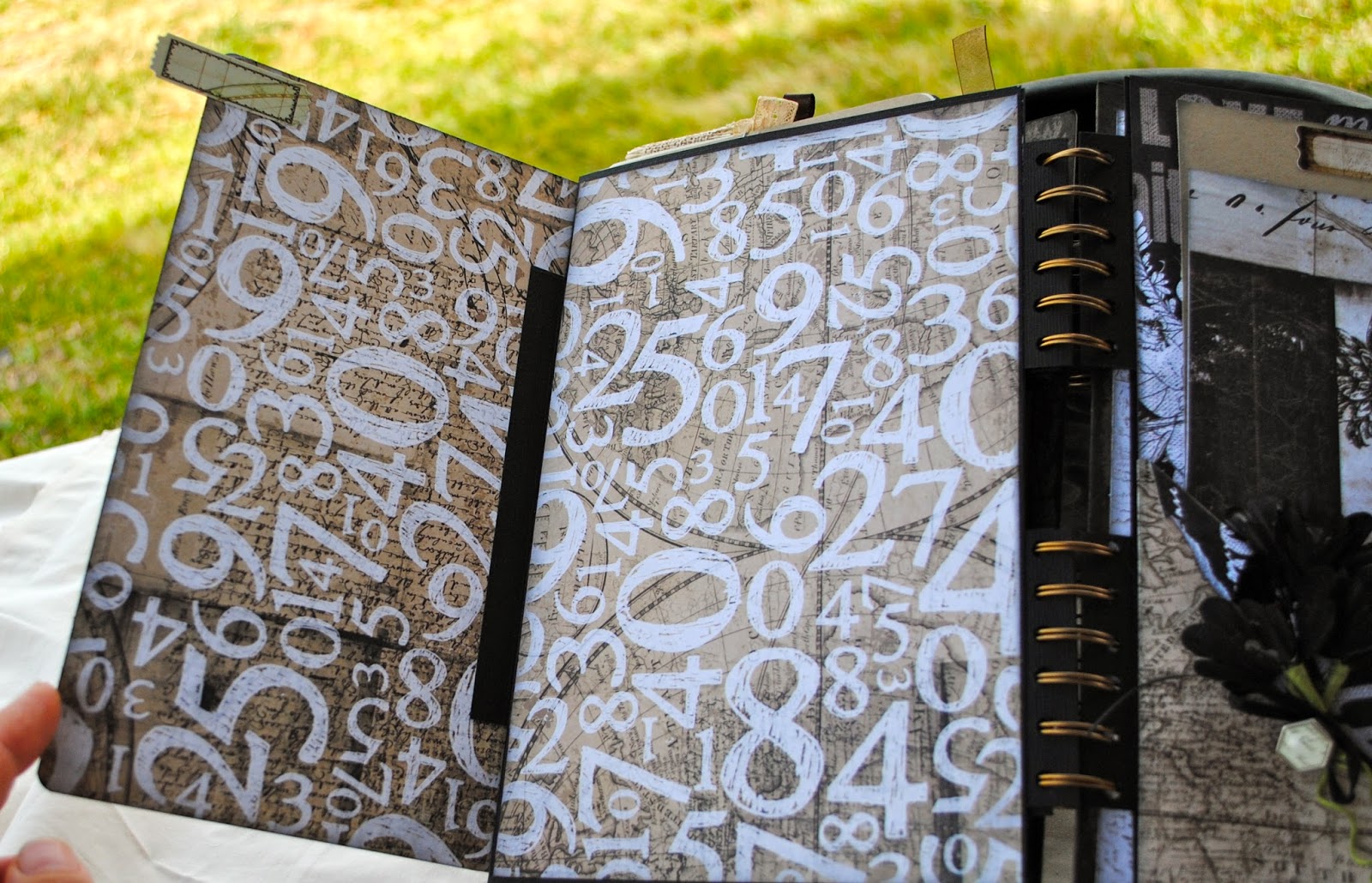
Next up is one of my favorite mini abums. It was made using the Engraver paper collection with matching blossoms. The mini is a larger size so it holds quite a few photos. The paper collection was just a lovely vintage feel. Take a look:
I added many different sized envelopes throughout the album. They are great for holding tags and photos.
A little offset flip page. I love how the stickers and brads add so much to the paper.
Just had to throw a bit of vintage lace in!
As you can see, this mini is interactive. Love all the flaps and pockets!
Somewhere in my musings I purchased a whole stack of vintage envelopes (some even had letters in them). I added one here for a great vintage look. You can see in the pic above I covered the address with a chalkboard mat. I love the post stamp and the real stamp still adhered to it!
The page on the left has a vellum envelope stamped with a french word stamp and adorned with bits and pieces from the paper collection.
A modified waterfall page. Great way to add tons of photos!
The back cover is distressed with a variety of ink and paints to add to the vintage feel.
My third project here today is a mixed media canvas. This is one of my personal favorites that hangs right by my desk. It brings me happiness and I really like the way it turned out. Those of you who visit regularly know how much I love playing with gelatos. The background of this was made using a variety of colors of gelatos. I added layer upon layer of tissue paper, stamps, and some drips made with gelatos and water. From there I added a variety of papers (from the scrap box), acrylic tags, ribbon and lace, and various other embellishments.
The lower right hand corner has a small album made from tags. Inside you will find a photo of each one of my kids (That's my baby boy below!)
I hope you enjoyed the post today. It was long but who doesn't love looking at photos?! Do you like what you saw? Then my job is complete! I do this to inspire people and have some fun along the way. Have a great day!


No comments:
Post a Comment